Calendar view design to prevent missed payments
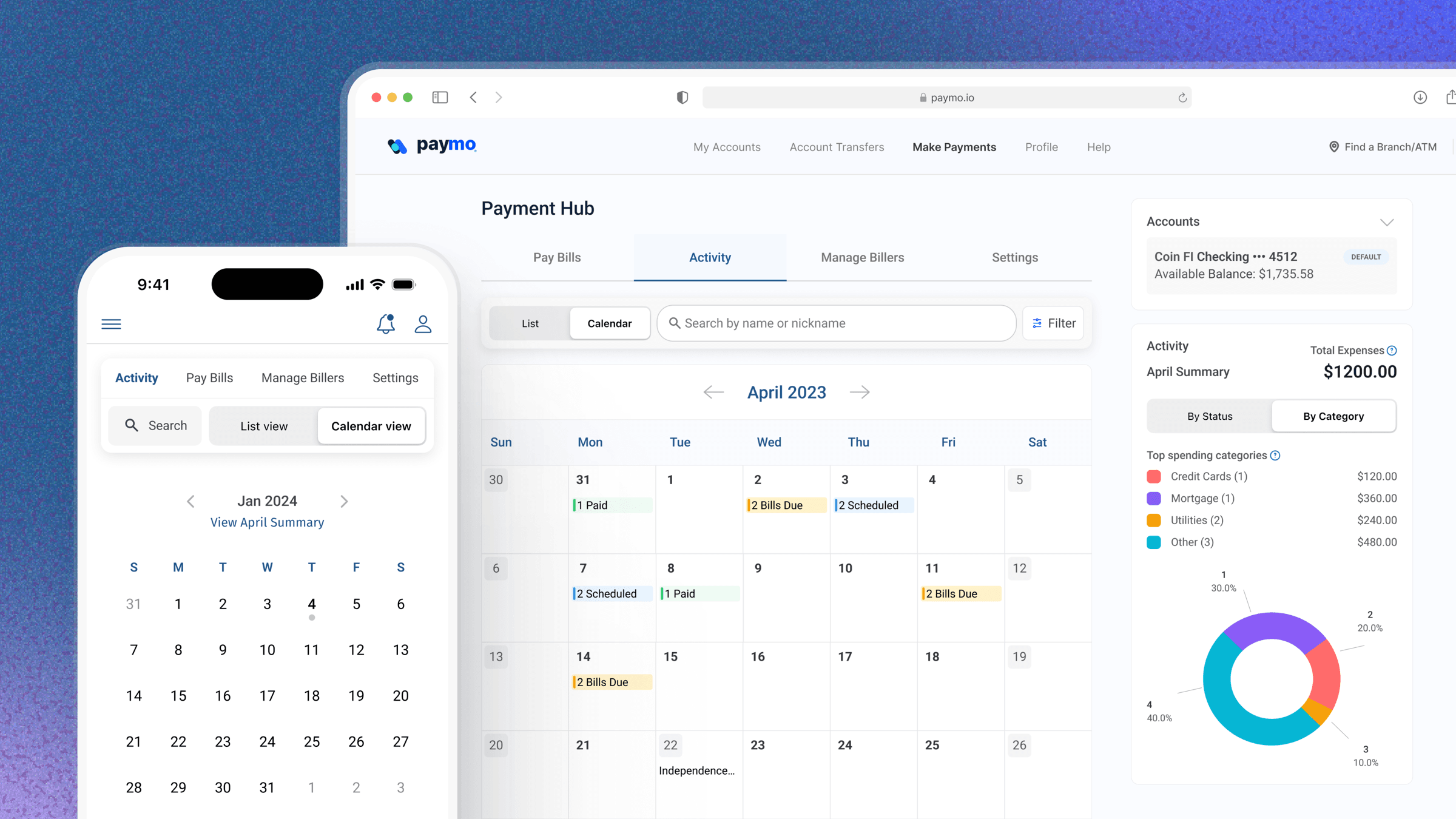
At a glance
I'm part of the team at Paymentus building the bill-pay product used by banks and credit unions like Citizens. This feature is one part of that platform.
The problem
Users had no single view of upcoming bills, causing missed payments and paid avoidable late fees.
The outcome
Shipped the product's first spending-insights layer working closely with Product Manager, 3 Developers.
Why it mattered
When I joined, the team was mid-migration, rebuilding their legacy product with a hard dependency: customers wouldn't move over until the new product reached feature parity. The calendar view was one of the missing pieces, and its absence had a direct user cost. Without a single view of upcoming obligations, users were missing payments, absorbing avoidable late fees, and losing trust in a product meant to simplify their finances.
The stakes were also structural: this wasn't only a nice-to-have feature request, it was a migration blocker. Shipping it well determined whether high-value accounts would move over at all.
The Insight
When we asked financial institutions for their desktop bill pay user demographics, the data was clear: the majority were boomers. These were high-balance, high-frequency bill payers who complained most about having no overview of their payments. That one insight reframed the entire solution. These users grew up marking bills on a physical calendar. The question became: how do we replicate that familiar mental model in a digital product and make it actually useful?
How it landed
Improved efficiency
Users generated ~11,366 month-navigation events with minimal need to click into individual bills. Calendar View replaced a multi-step digging process with a single visual scan for upcoming and historical payments.
Risk reduction
Weekly usage held steady at 1,800–3,200 unique users, becoming part of users' regular billing routine. It meant the view had become part of users' regular billing routine rather than a one-time curiosity, directly reducing the risk of missed payments and late fees.
Revenue impact
The clearest signal of impact came from the platform's largest account: 8,000 of its users adopted the feature, accounting for 15% of all Calendar View usage. Designing around this account's workflow validated the feature's value for the business's highest-revenue customers.
How I approached it
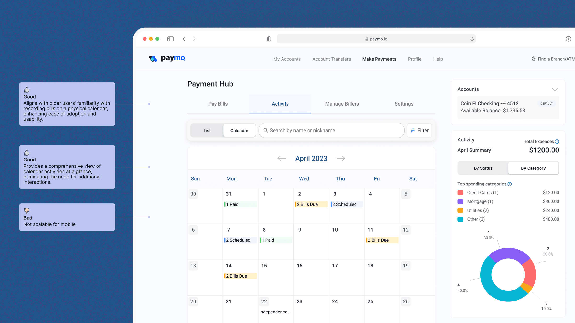
Traditional calendar view
This aligned with users' existing mental model and surfaced a full month of activity at a glance but the layout didn't scale to mobile, where most bill-pay sessions happened.
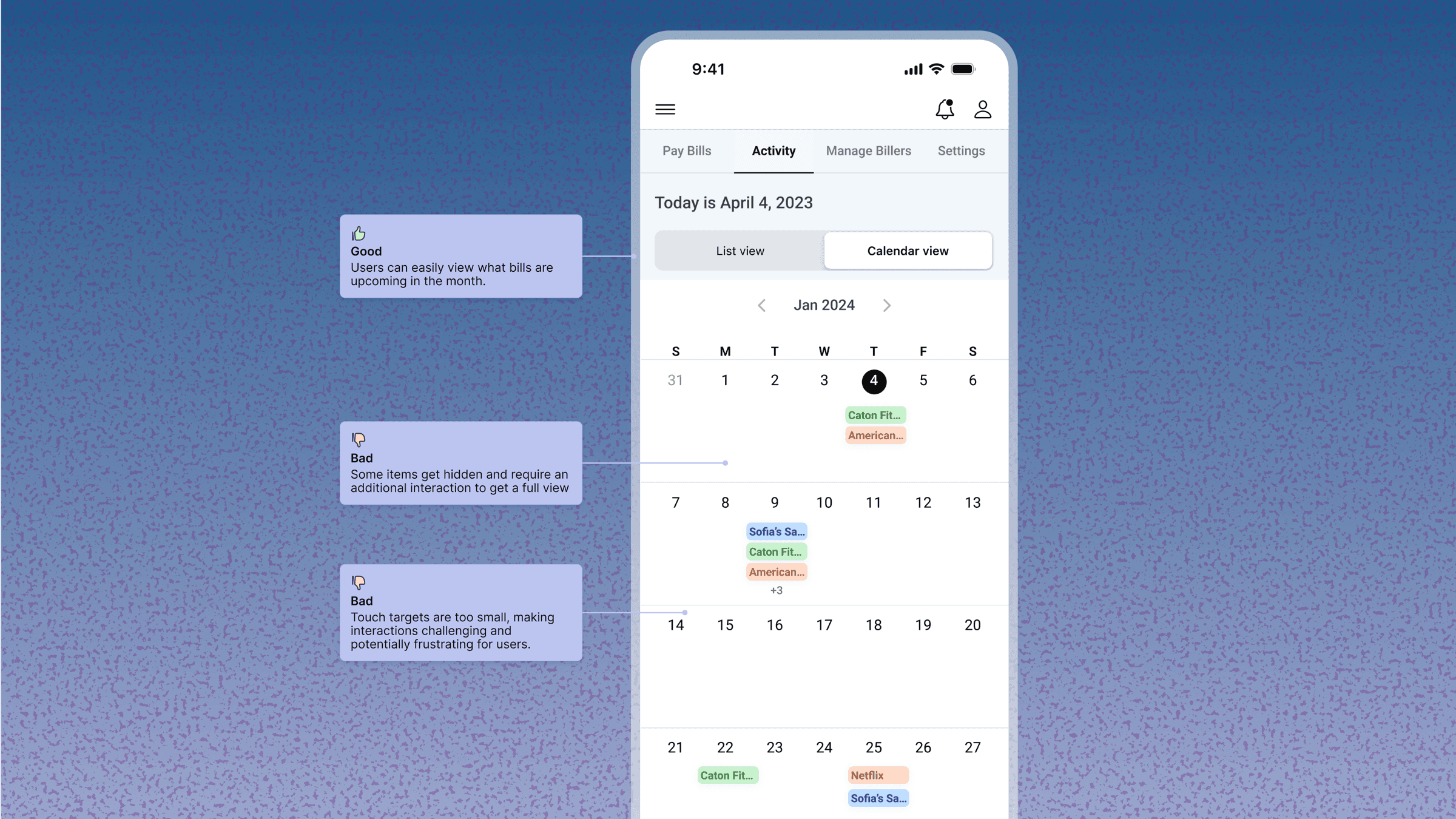
Calendar with inline context
I explored surfacing bill status directly on each date, iOS-style. Touch targets were too small and states got hidden behind extra taps. It solved the mobile problem but broke the at-a-glance goal.
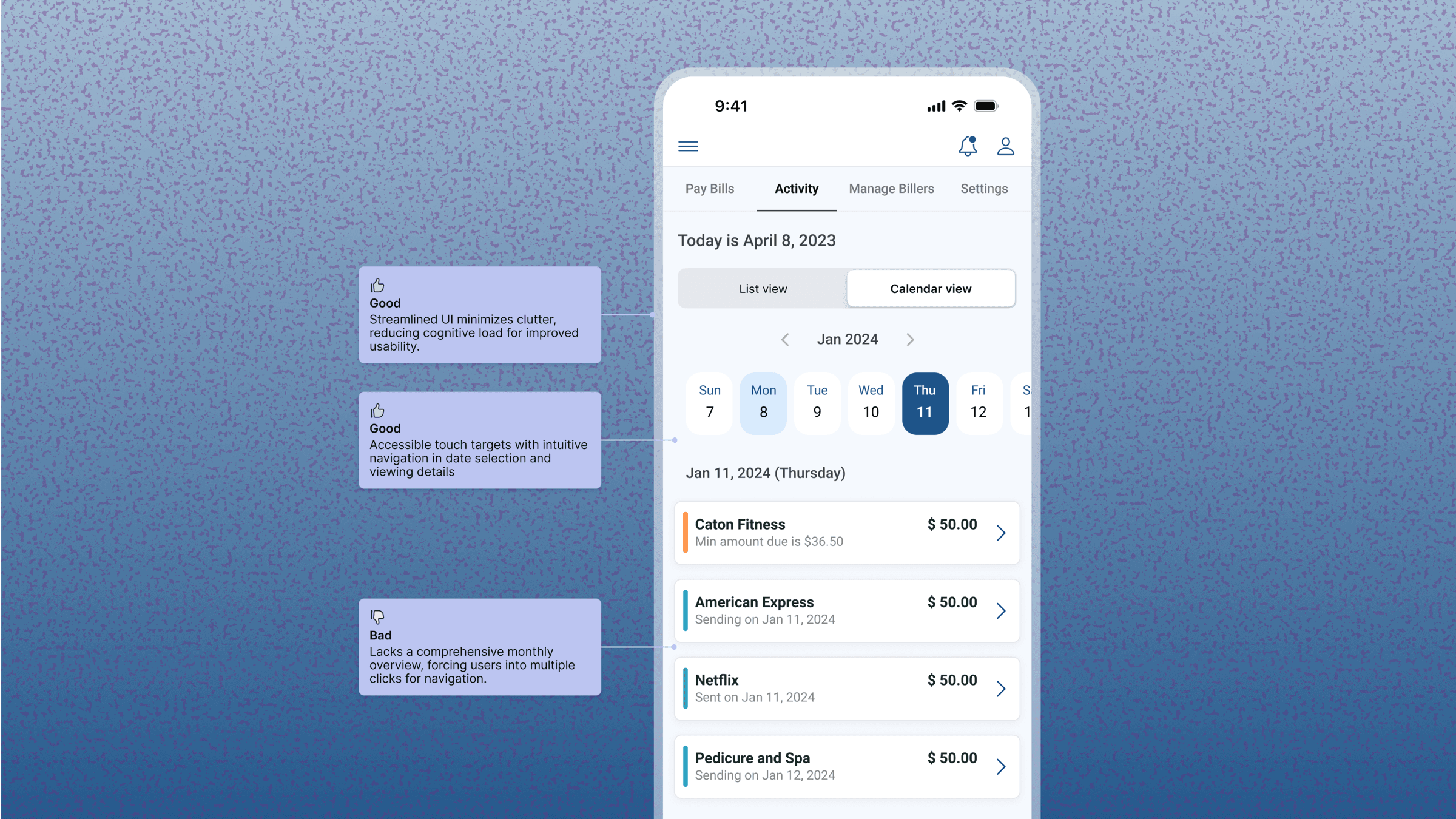
Weekly view
I also tested a weekly view to reduce cognitive load, but it under-delivered on the monthly overview users actually wanted, so I moved away from it.
Final Direction
Final direction combined the monthly mental model with mobile-sized touch targets and inline status color-coding — giving users the full-month overview they were used to, without sacrificing usability on the device they used most.
After shipping the first version, the data told a different story than expected: strong traffic into Calendar View, but low conversion into bill pay. My hypothesis was that people were using it to check a top-level summary, not to complete a task.
To test that, I used Gemini to research what financial-summary data users care about most, which surfaced three signals: trend, cash flow, and category allocation. That gave me a direction, so I used Figma Make to quickly prototype a few versions of an insights widget and get the team aligned on building it.
Dev bandwidth meant we couldn't ship the full vision, so I scoped it down to the highest-leverage slice: bill status and category breakdown by month.
I'm constantly trying to improve my portfolio. Give me a thumbs up if you made it to the end of this project and enjoyed looking at it.