Design system rebuild to reduce cognitive load
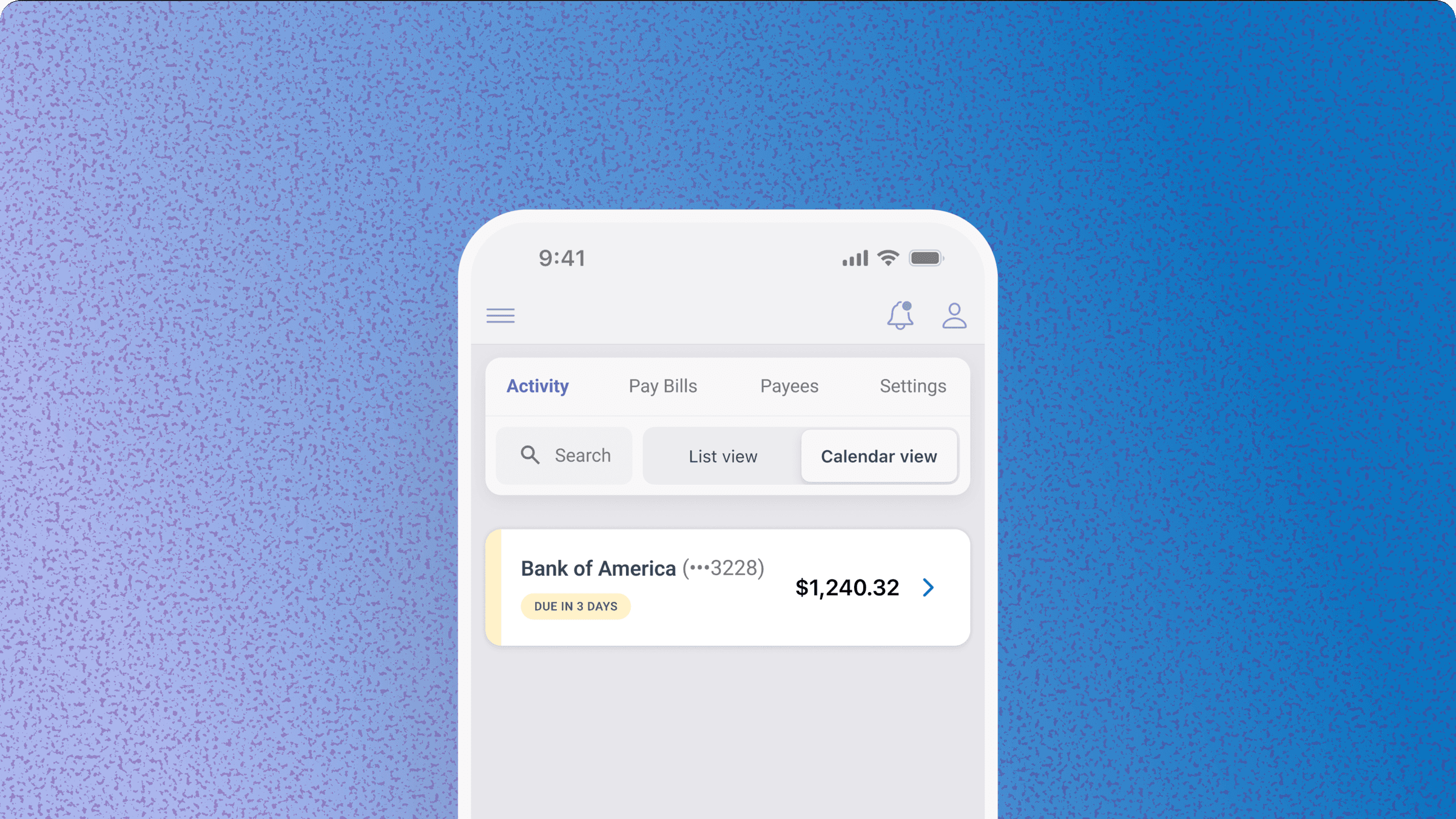
At a glance
The problem
The bill pay product had no consistent UI. Every new flow we shipped introduced new patterns. The product was starting to look like it had been built by 3 different teams.
The outcome
Reduced 9 font variants to 4 on the biller card. The standards set here became the foundation for components across the whole product. Today the biller cards surface to 30,000 daily active users and the system continues to grow more consistent every quarter.
How I approached it
I started with a critique of the current system.
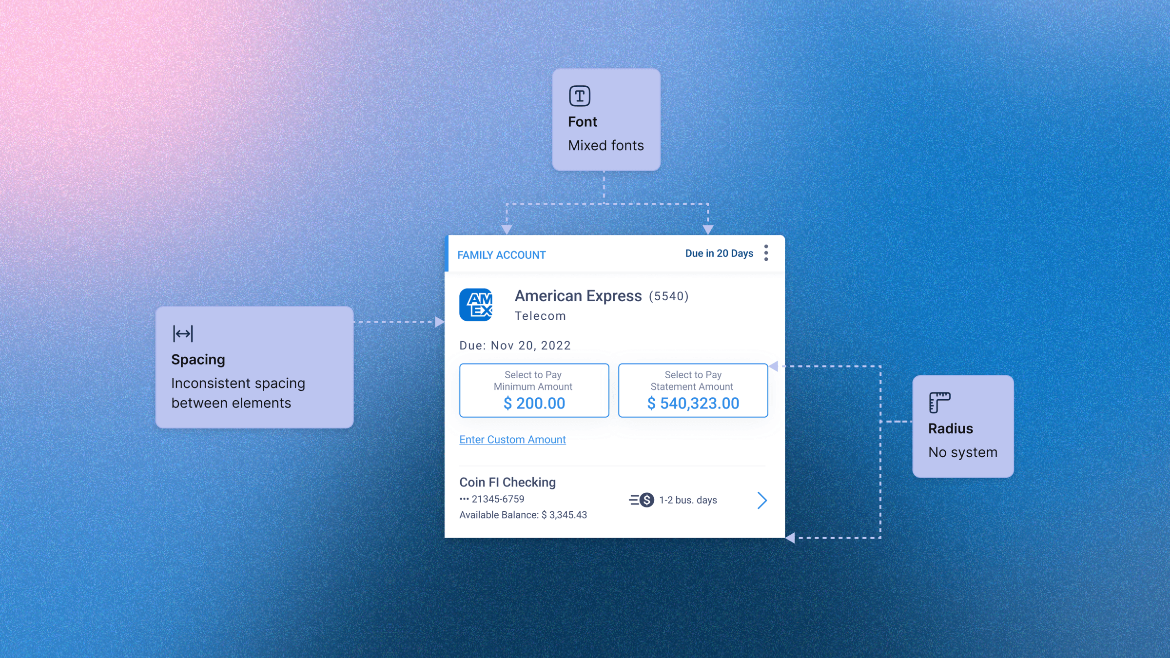
No defined system led to inconsistencies
Without a defined foundational system, the biller card was inconsistent in style and behaviour, creating a poor user experience across the platform and weakening the product.
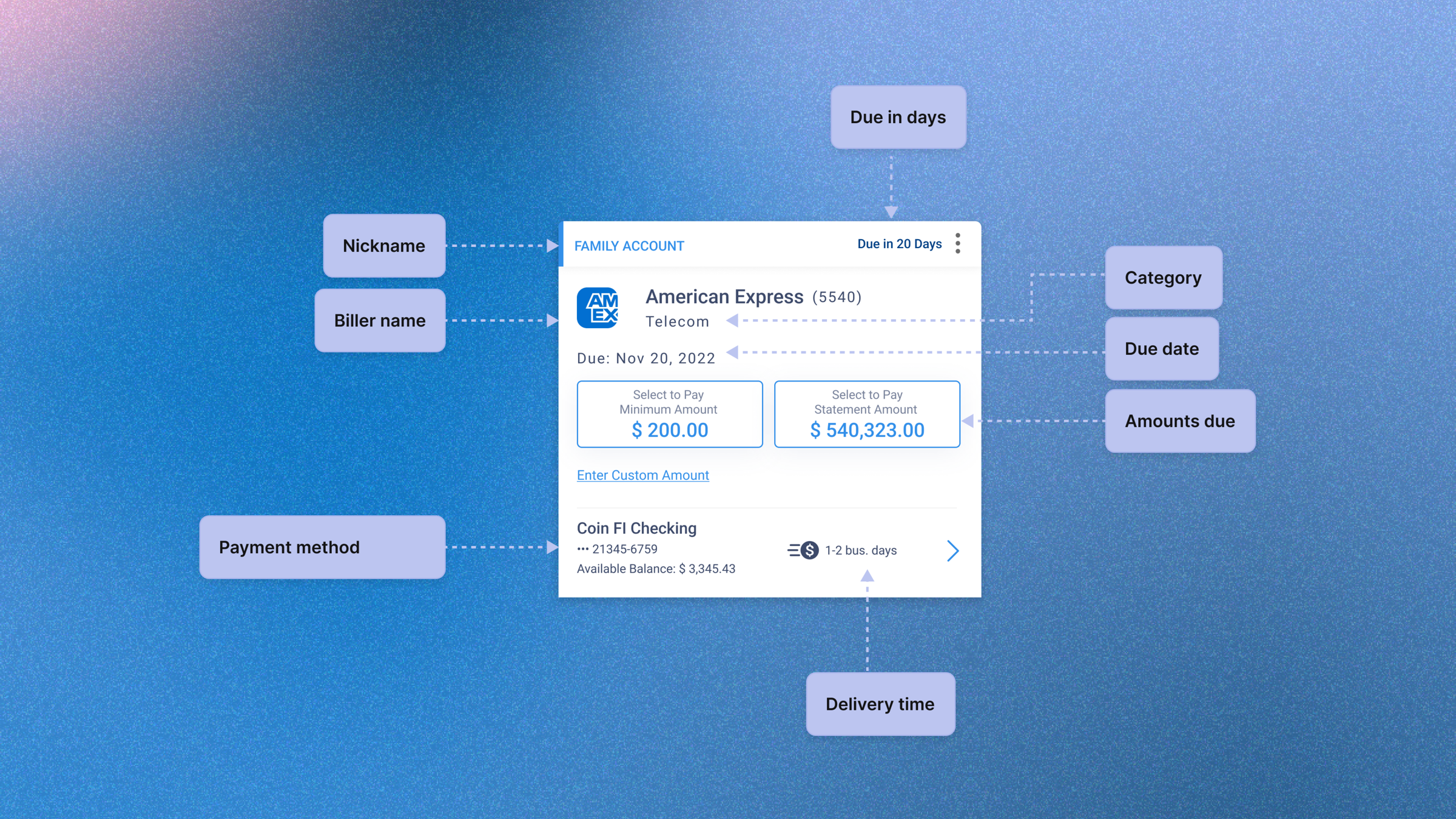
Too much information led to decision paralysis
Showing eight content types on a single card forced users to process payment method, delivery time, amounts, and due dates simultaneously. The card tried to answer every question at once and answered none of them clearly.
The Insight
This was more than just a biller card redesign. It was a chance to set a standard moving forward. I ran Maze tests to identify exactly what information users look for when making a payment, layered in months of accumulated UI feedback, and used that data to decide what earned a place on the card and what didn't.
The biller card became the foundation the design system was built on. Standards set here propagated across pay by card, autopay, and payment activity flows.
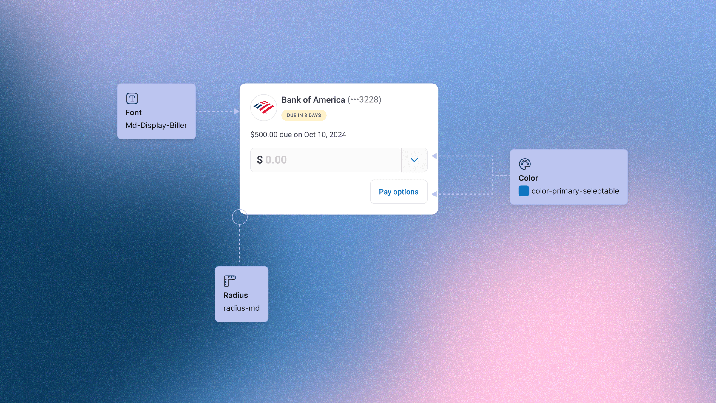
How tokens enabled consistent and scalable designs
Using tokens ensured every biller card rendered consistently across the product, elevating the overall product experience.
How restructuring card content reduced cognitive load
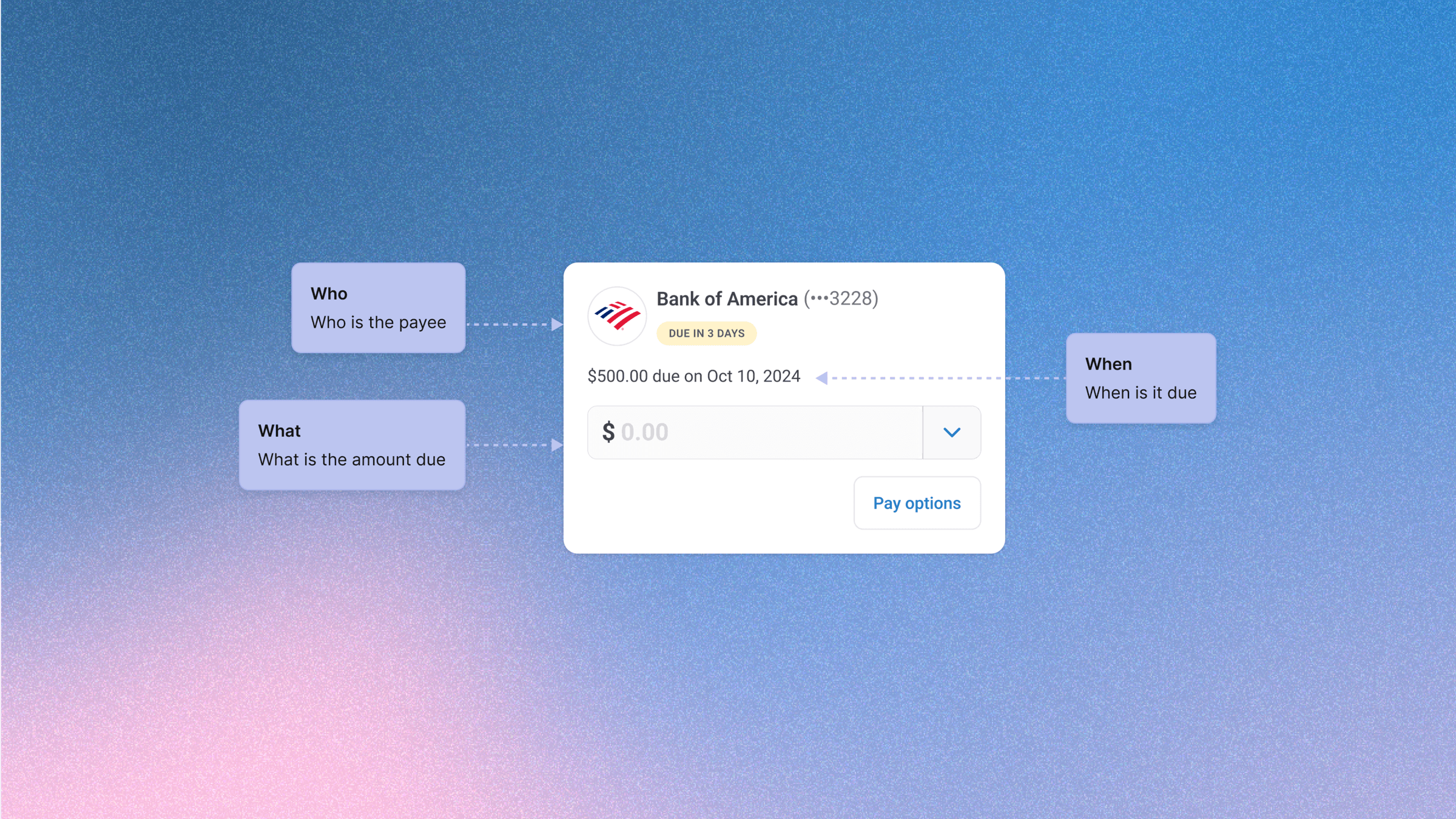
Breaking down the card into three clear questions — who is the payee, what is owed, and when is it due — gave users a predictable scanning pattern. The redesigned hierarchy surfaces only what users need at the moment of action, reducing the cognitive load.
The Outcome
Reduced 9 font variants to 4 on the biller card. The standards set here became the foundation for components across pay by card, autopay, and payment activity flows. Today the biller cards surface to 30,000 daily active users and the system continues to grow more consistent every quarter.
Improved efficiency
Reduced design-to-dev cycle time by roughly 40%, accelerating time-to-market.
Risk reduction
When components were built on WCAG-compliant tokens, it significantly lowered the risk of design debt.
Revenue impact
Releasing and improving new features became easy, helping acquire new businesses and meet their needs faster.

I'm constantly trying to improve my portfolio. Give me a thumbs up if you made it to the end of this project and enjoyed looking at it.