Signal
Simplifying experiment decision-making for internal teams.
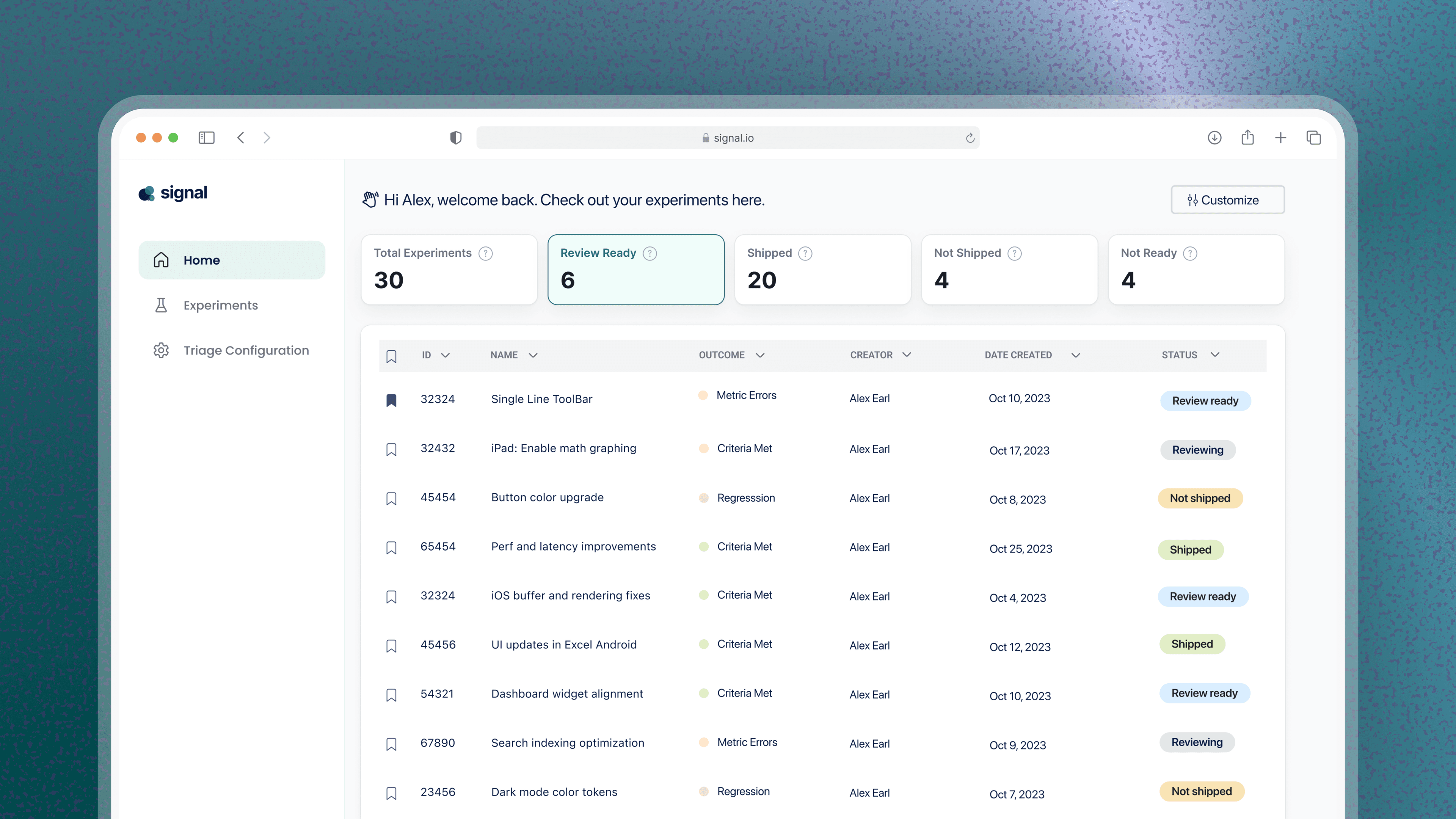
At a glance
I worked as a freelance designer to design an internal tool for a tech company to review experiment results.
The problem
The tool presented experiment data without helping users understand what it meant or what to do next.
The outcome
Shipped to 1,000–2,000 internal users. Teams reported faster triage, fewer follow-up questions, and less back-and-forth interpreting whether a metric was actually a problem.
The Problem
The existing internal tool was built by and for engineers, which displayed the raw experiment data. Whether a metric move mattered, whether it was good or bad, and whether it warranted action was left entirely to the person reading the dashboard. For PMs and non-engineering stakeholders who needed to make ship or no-ship calls quickly, that gap slowed decisions down and introduced inconsistent judgment calls across teams. Different people reading the same data could reach different conclusions about whether an experiment had a good outcome.
The Insight
The existing tool treated every user as if they had an engineer's fluency in interpreting raw statistical output. Most people using it didn't and they needed the tool to make a judgment, not just present a number. The goal for Signal became building a decision-making layer on top of the raw data, without hiding the data itself from users who wanted to dig deeper.
How I approached it
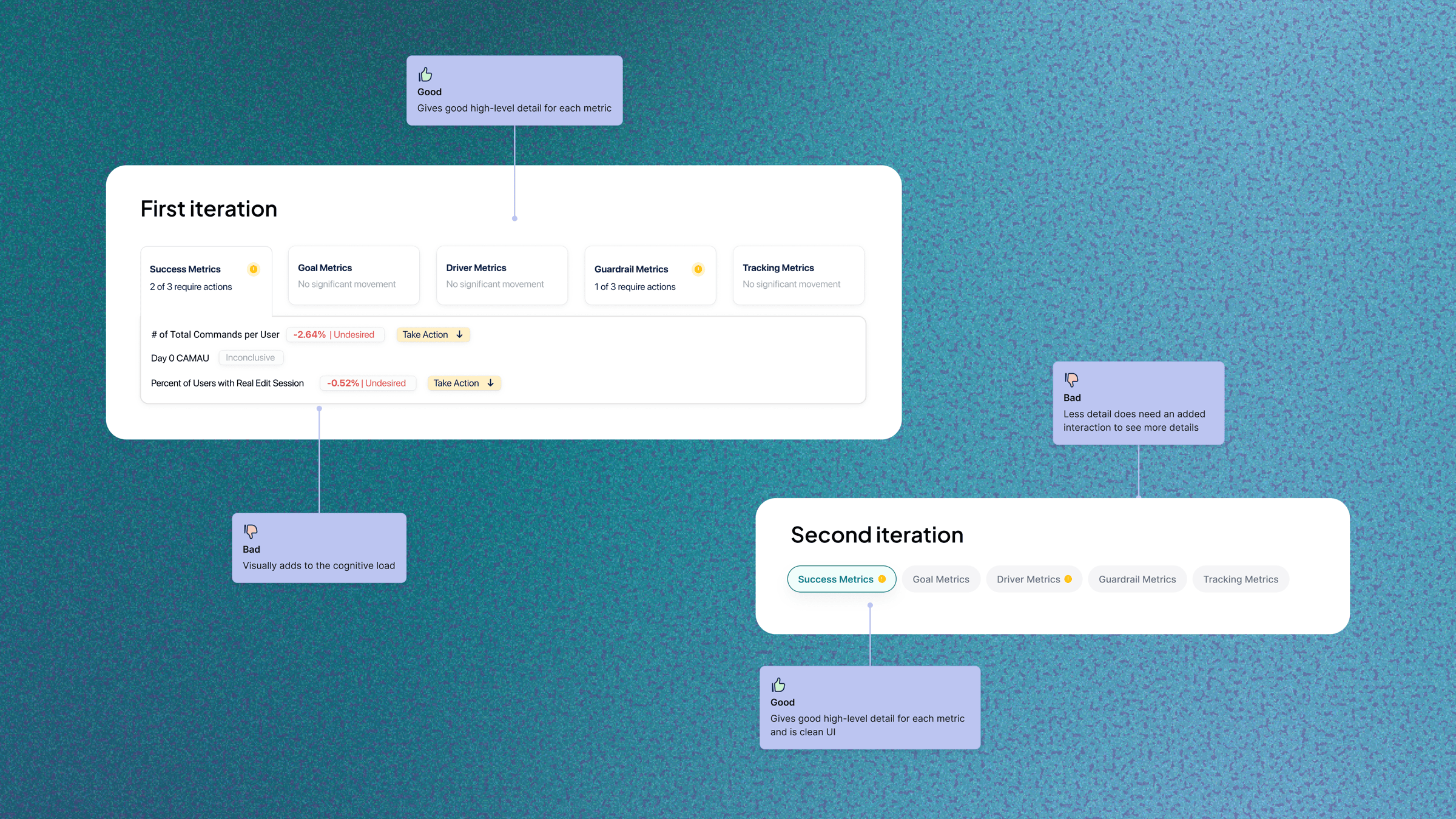
Grouping metrics into status-driven tabs
The tab style with icons gives users a directional read at a glance, showing which category needs attention without clicking into every metric.
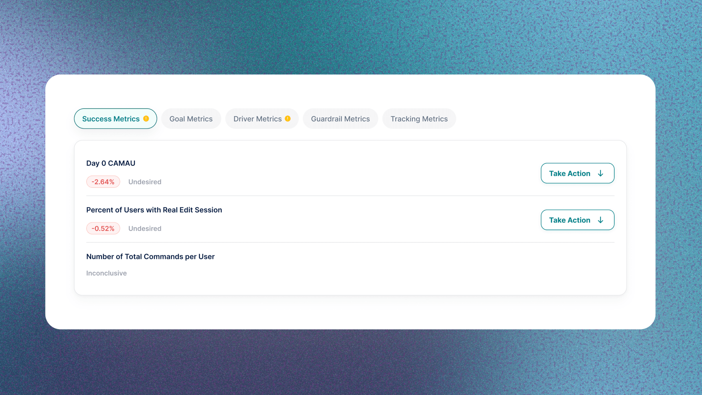
"Take Action" on flagged metrics
When a metric showed an undesired result, the interface surfaced a direct "Take Action" prompt beside it, not just a flag. The original tool just showed data, but this closed the loop from noticing a regression to taking action, directly solving the core problem Signal was built for.
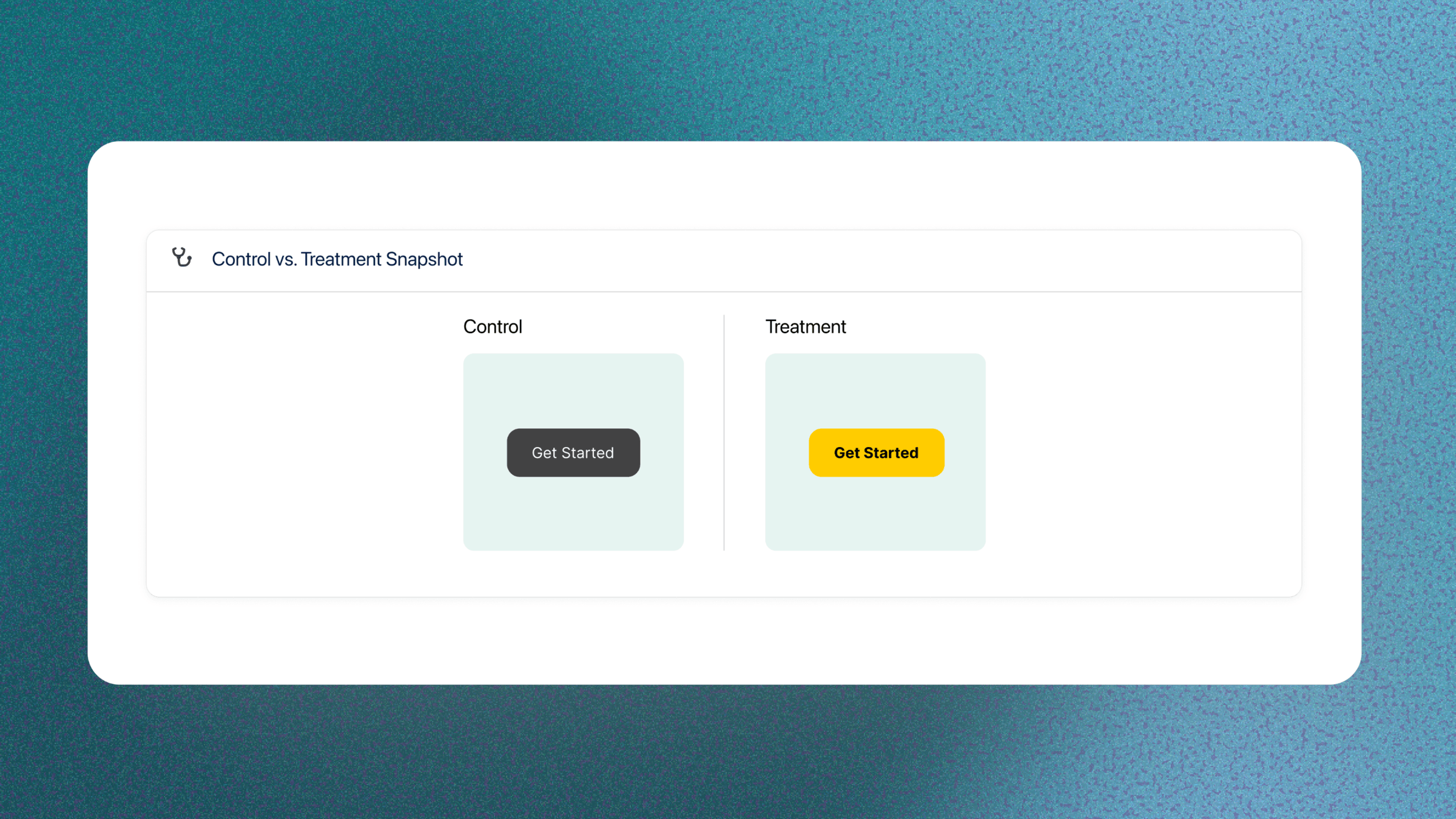
Control vs. Treatment visual snapshot
I added a side-by-side visual snapshot of Control vs. Treatment, instead of relying solely on text descriptions of what changed. A visual snapshot is faster to parse than a text description.
Final Direction
Signal's home view shows experiment status at a glance, while the detail view breaks results into categorized metrics, clear guidance on what needs attention, and a visual control-vs-treatment comparison — turning raw experiment data into a tool teams could act on, not just read.
The Outcome
Beyond adoption, Signal changed how teams triaged results day-to-day. Reviewers reported faster triage decisions, fewer follow-up questions about whether a metric mattered, and less back-and-forth clarifying good vs. bad outcomes — the exact friction Signal was built to remove. The tool shipped to 1,000–2,000 internal users, replacing a workflow that had left interpretation entirely up to whoever was reading the raw data.
I'm constantly trying to improve my portfolio. Give me a thumbs up if you made it to the end of this project and enjoyed looking at it.